


Org Charts
Org charts are an easy way to increase communication in a department. They are also very difficult to keep up-to-date if you are doing it manually. Most org chart solutions we have available to us (Outlook and WorkDay) only show a very small section of an org chart at a time when you want to see the whole picture.
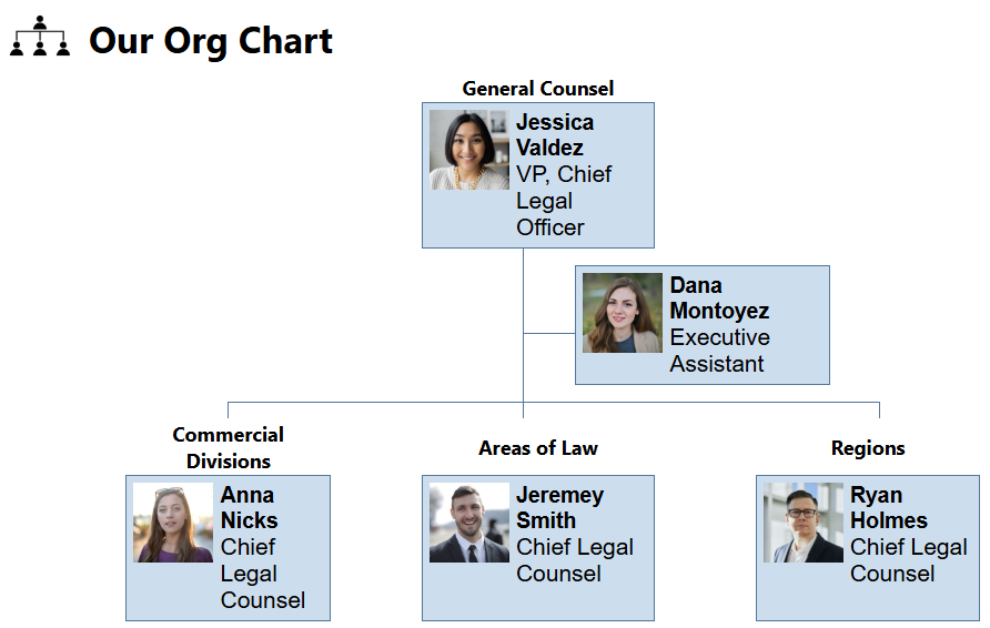
Above is the simplified org chart we show on our department home page. Clicking on a person takes you to the entire org chart at a glance with the person you clicked on highlighted in orange.
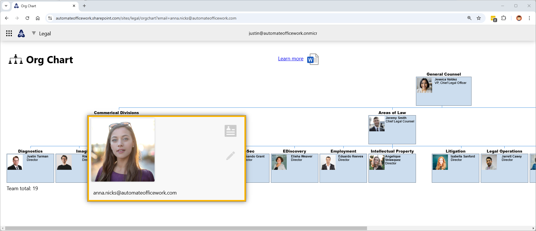
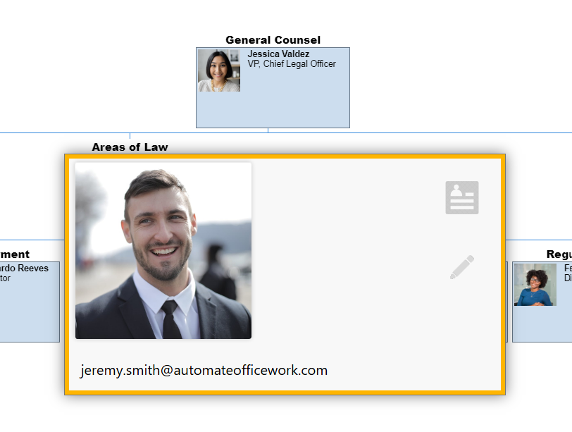
Clicking on a person shows you their individual card with a link to view their bio page and a pencil icon to edit their details, overriding the automated data we get out of Oultook.
Below is a zoomed in view. Notice that each person can now have a team description above their individual box.
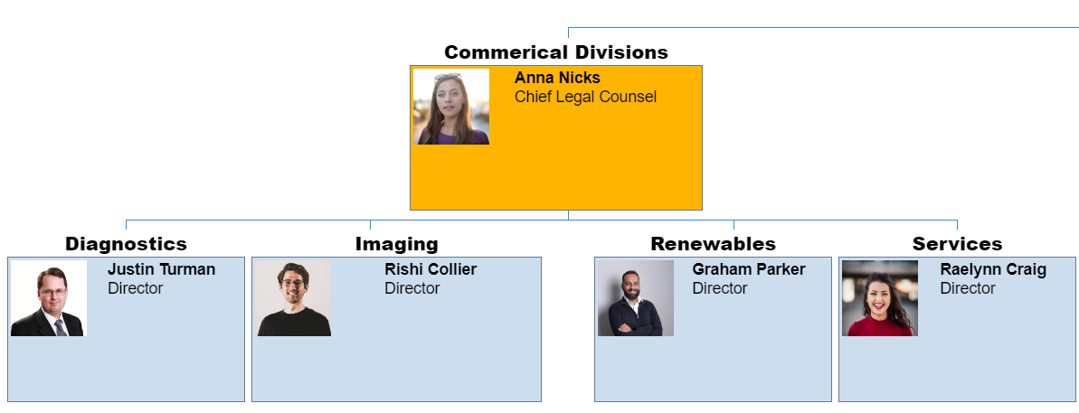
The person's photo, name, email address and title come automatically from Outlook and are updated automatically however often you wish for the update automation to run. New people are added and old people removed automatically. You can even have the automation compare the new list of people with the old and to give you a report of who joined and who left. You can then use this report to initiate your onboarding flow and set up system accounts and access for the new people. Or at least send an email to their manager and have the manager make the requests. For people who left you can automatically remove their accounts and access.
Everything begins with people. Connecting people is a great way to improve your organization.
How can we automatically generate an org chart? As mentioned, we first need a data source of people like WorkDay or Outlook. WorkDay has an API that your organization may allow you to use. My organization did not allow me to use it, so I went straight to using Outlook.
Power Automate has an action where you can input a person and get back a list of their direct reports. It takes about 1 second to receive this reponse. This means to get the details of an entire department, you would input the email address of the department head. The automation flow would then need to recursively run over the resulting direct reports to get their direct reports, etc until the entire flow is finished. I have a basic tutorial on how to do this at this link. It simply creates a comma separated list of everyone in the department.
There is an issue with this approach. It takes 1 second per person in your department. This is fine if you only have a few people in your department. 100 people? Your user will be sitting there waiting for 3 minutes. 500 people? More like 15 minutes. So what we do is we run the automation on a regular basis in the background to produce a text file of people data that our solution can retrieve in only one second. How often do you need to refresh the people data you have on hand? It depends on your organization. Most organizations are fine with getting the data every night at midnight or every Monday morning at 6AM.
What format should your people data be in? It depends on the solution you are using to generate an HTML page with your org chart. There are many solutions available for JavaScript that will parse out a data file and create a beautiful org chart experience for your users. The most beautiful solutions are paid. I found a solution offered by Google for free. So I used that one. It's not the most beautiful solution and doesn't offer all the features the others provide, but it gets the job done. It was good enough for me.
I used Google Charts for my org chart solution. It's free and you can find it at https://developers.google.com/chart/interactive/docs/gallery/orgchart. It has many features to display all kinds of charts. One of those charts is an org chart. So it works for us. There is sample code that shows you how to use it.
<html>
  <head>
    <script type="text/javascript" src="https://www.gstatic.com/charts/loader.js"></script>
    <script type="text/javascript">
      google.charts.load('current', {packages:["orgchart"]});
      google.charts.setOnLoadCallback(drawChart);

      function drawChart() {
        var data = new google.visualization.DataTable();
        data.addColumn('string', 'Name');
        data.addColumn('string', 'Manager');
        data.addColumn('string', 'ToolTip');

        // For each orgchart box, provide the name, manager, and tooltip to show.
        data.addRows([
          [{'v':'Mike', 'f':'Mike<div style="color:red; font-style:italic">President</div>'},
           '', 'The President'],
          [{'v':'Jim', 'f':'Jim<div style="color:red; font-style:italic">Vice President</div>'},
           'Mike', 'VP'],
          ['Alice', 'Mike', ''],
          ['Bob', 'Jim', 'Bob Sponge'],
          ['Carol', 'Bob', '']
        ]);

        // Create the chart.
        var chart = new google.visualization.OrgChart(document.getElementById('chart_div'));
        // Draw the chart, setting the allowHtml option to true for the tooltips.
        chart.draw(data, {'allowHtml':true});
      }
   </script>
    </head>
  <body>
    <div id="chart_div"></div>
  </body>
</html>
Out people data file has to be in JSON format like:
[
[
{
"v": "Mike",
"f": "Mike<div style='color:red; font-style:italic'>President</div>"
},
"",
"The President"
],
[
{
"v": "Jim",
"f": "Jim<div style='color:red; font-style:italic'>Vice President</div>"
},
"Mike",
"VP"
],
[
"Alice",
"Mike",
""
],
[
"Bob",
"Jim",
"Bob Sponge"
],
[
"Carol",
"Bob",
""
]
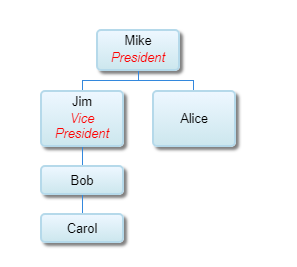
]This produces the below org chart.
Your automation flow will need to produce a similar text file. When your user opens your SharePoint page the Google Charts code will parse out this text file to create the spreadsheet.
Further Enhancements
What if the data coming from Outlook is not complete? What if Bob is called "Robert" in Outlook and we want the org chart to say "Bob"? We need a way to override the Outlook data.
I made it so when a user clicks on a person's box a data card appears. There is a link to the person's bio on my biographies platform, but if the person that opened the card is the person, their manager, or a site admin, there is an extra button to edit the data.
This data is then connected to a SharePoint list of overriding data. So when the Outlook data is parse, we also check to see if there is overriding data on the SharePoint list and show that instead. For example, some accounts in Outlook are not real people, but merely system accounts like "info@company.com". These appear as being managed by a person, but should not appear in our org chart. So we flag them as hidden and don't show them on the org chart.
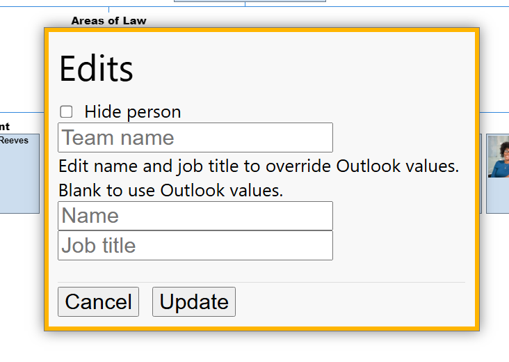
In this way, we can automatically get updated org chart data, but we also have flexibility to override data.
Conclusion
Org charts are one of the most simplest things you can automate that will have a big impace on the people in your department. It increases the ability for people to connect with each other. It's also one of the things that few people want to update manually and keep up-to-date. By automating this you get rid of the need for a lot of manual work.
Automating org charts is only the first of many automations you can do to automate people work. See the podcast episode on Automating People Stuff for more ideas.