


Intake

Intake is one of the biggest tools a team has to automate their workflow.
Most teams receive requests for work. And when those requests are unorganized, not recorded, chaos often follows. Email is often the biggest culprit. If your team is receiving random requests by email and then you have conversations back and forth to get the inputs you need and in the end there is no record of work being done... well, you need an intake system.
Instead of receiving random emails, direct requesters to a form. They can fill in the form with minimal guidance and give you the exact inputs that you need. No need for week-long conversations. And when the user submits the request you can be assured that you are getting the exact inputs you need to do the work. If not, you can update the form to improve it for next time. And when the user submits the form, there is a permanent record of work being done.
Let me show you what this looks like.
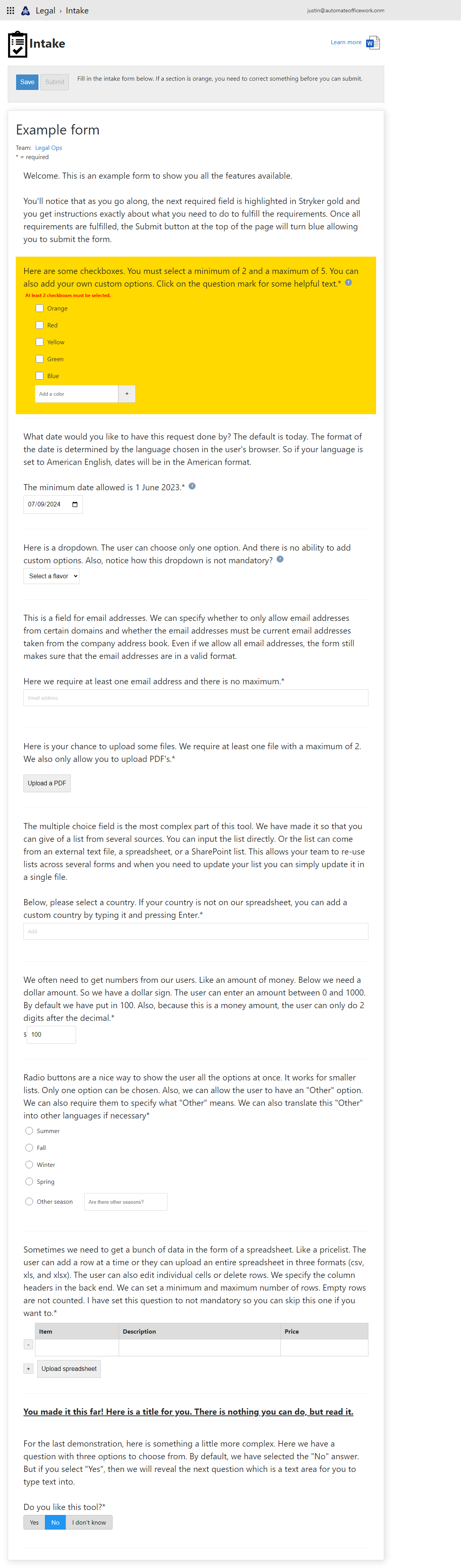
The first thing you notice is that this is a request intake form platform. It houses several forms for several teams and the user has the same user experience across all of them. There is a link to a Word document where users can read a one-page "Learn more" document. Users can save their progress to work on the form later, but can only submit the form once minimum requirements are met.
This form has a name and there is a team that owns the form. Clicking on the team name shows you all the forms that this team owns.
This form has 10 types of data that it can collect. All are fully customizable so you can get the exact data that you need from requesters.
The first data type is a simple paragraph. This is where you can welcome the user and give instructions on what is coming up. The users doesn't have to do anything but read.
Next are checkboxes. Users can select multiple checkboxes. You notice that we have a paragraph explaining to the user. At the end is an asterisk letting them know that this question is required. Then we have a blue circle with a question mark. Clicking on this gives the user a pop-up with even more information to give the user training exactly where they need it.
Below this is a message in red telling the user exactly what they must do in order to fulfill the requirements. This entire section has an orange background because it is the next thing that the user must do to fulfill the requirements before submitting.
Multiple checkboxes can be checked. This one has a minimum of two that must be checked and a maximum of 5 was set by the team. Here we see a group of colors to check. And at the end is a box where the user can type additional colors. Notice that the box doesn't just say "Add an item". It has been customized to say specifically "Add a color". This can be customized to exactly your situation.
Next is the Date data type. The default is today's date and the team can set a minimum. The date picker is shown according to the regional preferences set in the browser so it will be displayed how the user wants to see the date.
A dropdown allows a user to select only one option. And notice here there is no asterisk at the end of the question so the user is not required to make a selection.
Email addresses are far superior to names. Names are not unique. Email addresses are. This form requires the user to select at least one email address. As the user starts typing a list of matching email addresses from their organization appears beneath, forcing the user to select a validated email address. In the back end, the team owning the form indicated to allow only current email addresses in their organization to be allowed. No more garbage information from users.
Next is a file upload section. The team set it to require at least one file with a maximum of two. And only PDF's are allowed to be uploaded. When the user clicks to upload a PDF, they will only see PDF's in their file explorer.
The multiple choice field is the most complex part of the form. It's made for when their are hundreds or even thousands of options. You would never want the user to see all the options. So we ask them to start typing. Like when picking a country. As they type, a list is shown below of items that match what they typed and then they can select one. There are multiple sources where the list of items can come from. Because things like lists of countries are used across multiple forms and rarely change, but should only be changed in one place when a change is needed, it makes sense to use a single source of information. This team indicated to use a spreadsheet as their data source of countries to list. The form pulls the list of countries from that spreadsheet.
The team also indicated that they wanted users to be able to enter custom country names. So if the user types in the name of a new country that isn't listed and they press Enter, this custom country is also added to the form.
Next is a number section. How many times have you asked a user for a number and they typed in "I don't know"? Or N/A? Well now you can require them to put in an appropriate number. This team wanted a money amount. So they put a prefix of "$" and allow for 2 digits after the decimal point. There's also a minimum of 0 and a maximum of 1000. Anything less reverts to 0 and anything over reverts to 1000.
Next are radio buttons. The user can only select one option, but now there is a final option that says "Other". The team indicated that they wanted to force the user to give more details if they select "Other".
How many times have you worked on a document and the user attached a spreadsheet they wanted you to manually include into the document? This is a manual step that we want to avoid. Especially since sometimes users actually attach grainy photos of spreadsheet that we then have to manually type each and every character trying to decode a fuzzy image. Well no more! The spreadsheet section forces the user to give us the data from the spreadsheet, NOT the spreadsheet file itself.
The user can manually type in and add rows. Or they can click the "Upload spreadsheet" button and upload the data from a separate file.
Next is a title section. You can use this to break up the monotony of a form or break up your form into sections.
The last type is select buttons. The user can only select one from a handful of options, but the selected button is displayed beautifully.
The "Save" and "Submit" banner actually follows the user down the screen as they scroll down the form and once all minimum requirements are fulfilled the Submit button is active and the form can be submitted.
There is extra functionality in the platform that a team can "Hide" a question by default. Then they can set a question so that if it is answered a certain way than a hidden question becomes visible. Questions can only be mandatory when they are visible. This allows for endless possibilities and you give your user a beautiful experience only seeing the questions that are applicable to them.